Category Archives: Existing photo processed by Bob Lawrence

The Old Land of Oz

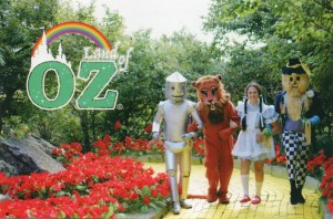
I dunno. I think the costumes are creepy.  The Tin Man looks like something from “Radar Men from the Moon” (1952)(look it up. it stars Commando Cody, the man with an asbestos ass).  Dorothy is lovely, though, fake pigtails and all.   The place opened in ’70, burned in ’75 and closed in ’80.  The fire destroyed the original Dorothy dress from the movie, along with other artifacts.  It fell into disrepair and was vandalized.  It’s now open again for short periods during the year.

John Mellencamp sang, “Life goes on, long after the thrill of living is gone…”

Postcard published by Land of Oz…no printer’s credit shown.

(I know that Dorothy looks as if she’s floating.  Trick of the light – she has her right foot raised slightly to look as if she’s walking.)
Grts, Pennington Gap

“Grts”, in post card lingo, often refers to a card with “Greetings from…” on the front.  The picture on the front of this card is some generic view of a river with a train steaming along it.  When I looked, the railroad in Pennington doesn’t get too close to the Powell River, anyway.  The overprint just ties it to Pennington, for tourism’s sake, you know.  I would date this card to the late 40s, early 50s.

Free Offer

From 1944, as the expiry date shows.  See Seven States! If your eyes are good, you can see the back of your head, clear around the world!

Glade Spring VA

To me, this is an interesting post card.  It was published by Asheville Post Card Company in the late 40s and it doesn’t feature original photographs taken by the company.  These are historic black & white photos that were colored in before printing.  No photographer is credited.  I suppose that the pharmacy provided the photos to APCC to use.

First Methodist Church, Johnson City TN

Other than the original photos being taken from different viewpoints (or using different lenses), there are four differences between these two cards:

The lower one, obviously, is the earlier.  I think it may have been taken pre-WWII.  The upper one, probably late 40s.

The differences I see:  First, the plate numbers are different (I can only date Asheville Post Card Company cards by inference.  I found another card in the E-7417 range that had a 1948 post mark).  Second, the shrubbery. Third, the sign on the corner in front of the church.  Fourth, the early one is titled merely “JC-71 Methodist Church, Johnson City, Tenn.” and the later one is “JC-75 First Methodist Church, Johnson City, Tenn.”

Professional Building Woodlawn Avenue Bristol, Tennessee

This damaged card is from the 1950s.  Woodlawn Avenue does not appear on any current maps of Bristol TN.  It may be under a different name now.

On the back: Professional Building, Woodlawn Avenue, Bristol, Tennessee  The Tri-Cities’ newest and finest office building. Five stories completely air conditioned with paved parking lot accommodating 170 cars. Beautiful interiors, elevator service, drug and fountain service. Gorham Boynton, manager. Telephone SOuth 4-4189

Thank you to Rob (see comment below), who wrote: The building is now Graceway Pharmaceuticals and the address is 340 MLK Blvd. Bristol, TN (08/31/21)

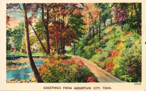
Greetings From Mountain City, Tenn.

mountaincityfr

mtncityback

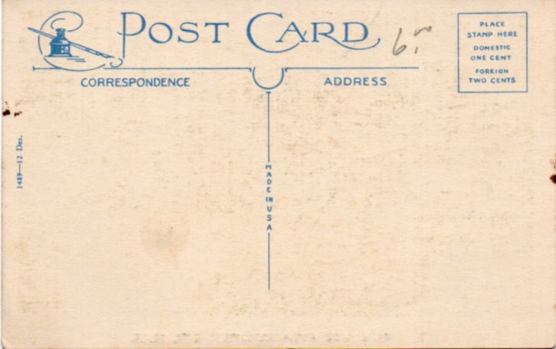
The style of the back of the card dates this to the 1930s.  Asheville Post Card Company was using this sort of anonymous back for some reason known only to the company.  Later, they were proud to identify themselves on all cards.  This is a linen-finish card.

Also, my research turned up the fact that the scene on the front is generic.  Not in Mountain City nor in its environs.  Although, an editor for APCC said, in an old interview, that people would sometimes “recognize” the scene as being in their particular area.

I did lighten the front of the card.  It’s got some age on it.

Btw, the lowest temperature on record in Tennessee was reported in Mountain City on December 30, 1917:  -32 degrees.

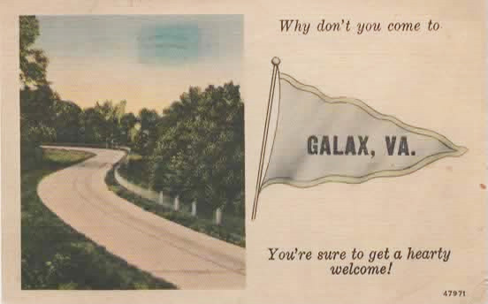
Let’s Go to Galax!

GALAXFRONT

GALAXBACK

Asheville Post Card Company issue called a “Pennant Landscape”
The “Galax, VA.” is an overprint for a standard card.

It was mailed in 1943, when Galax had half its current population.  It’s hard to read the writing, but I did find Sgt. Marrion W(oodward) Fisher.  Camp Santa Anita was a dog racing park in Arcadia CA that had been taken over by the Army for ordnance training.  Sgt. Fisher was born in 1920 in Bath VA.  He died in 2011 in Covington VA.

I think the signature on the card is “James”

Buford Williams and Gerald T. Lowe

Williams-Lowe

Buford’s on the left, Gerald “Jerry” is on the right.  Both were veterans of WWII.

Buford retired from TVA and died at 92 in Knoxville.

Gerald, who was from Maryville, died in 2003, but I don’t know anything more about it…can’t find an obit.

S.S. Nassau

If you were venturing into the southern climes back around 1956 or so, you might have been on this ocean liner:
nassau

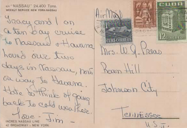
The S.S. Nassau.  It began life in 1922 as the S.S. Mongolia, built in England.  After a number of name changes, it became the Nassau from 1951 to 1961.  It ended up on the West Coast as the S.S. Acapulco, flying the Mexican flag, the only ocean liner to have done so.  But, after 40 years of service, it pretty much ground to a halt on the return trip from England, where she had gone for repairs to her prow.  After a couple of years as a hotel ship, she was scrapped in 1964.

Here’s the back:
nassauback

Note the Cuban Cure for Tuberculosis stamp, dated 1956.  The actual date of the postmark isn’t visible, but it couldn’t have been before 1956. Tracy and Jim are having a fab time, apparently, and not looking forward to returning.

This post card is larger than the more-or-less standard (5-1/2 x 3-1/2″).  It measures 5-5/8 x 4″.  Continental post card size is 6 x 4…just 2/8″ shy.

Group of ?Bathers?

I bought this in an antique shop in Bristol.  A a group of bathers photographed in a studio against an “ocean” background.  This is a Real Photo Post Card.  A one-off.  The Private Mailing Card (PMC) stamp block on the back, along with no division between the “correspondence” and “address” sides puts this in the 1907- 1914 range.  It is an undivided back card, but, for that short period, the U.S. Postal Service allowed a message on the left side of the back with an address on the right.

And the bathing costumes are right for the era.

Then, I got a look at Frank’s feet and legs.  They have had a hard time, but he’s not in the least bit ashamed of it.  Looks like a family group.  I can’t work out the writing, except for the “Frank” below the seated man.  The word above the standing man may be “Mabel” and refer to the woman.  The long word or words along the right bottom corner…well, I don’t know what that spells.

unidentified photounidentified back

Man With a Pistol

The actual picture is small – 2.25″ x 2.5″ and very faded.  I believe the stern man is a police officer, since he’s holding a Colt Police Positive, popular in the 1940s.

Morristown TN in the Early 20th Century

Posted on


This is a railroad post office franked postcard.  The mark reads “BRISTOL & CHATTANOOGA TR 4 JUL 11 1917 R.P.O.”
It was printed by Curt Teich of Chicago and published by The Novelty Store in Morristown.
If this is looking west, then the old Kingmyer Hotel is up there somewhere on the right.

Oh, and I hope Miss Sarah Stonecypher of Limestone knew who “Guess Who?” was…

Early Real Photo Cards

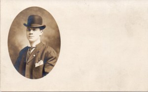
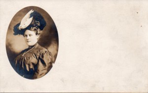
I can’t tell you who this stylish couple is.  I can’t tell you where they lived, but I can tell you when the photos were taken, within a 4-year period – 1903 to 1907.
The paper these real photo post cards are printed on is an Ansco product called Cyko.  The process of the printing is chlorobromide, yielding a warm brown tone.  Cyko came on the market in 1903 and the undivided-back era ended in 1907, when the Universal Postal Conference agreed to allow a message area on the left side of the back, not just the address.  There’s probably a little slippage on the end date, since, as far as I can tell, the U.S. Post Office didn’t ban these backs, just let them fall out of favor.

The blank area to the right of each picture was there for a message of some sort.  These are either one-offs or part of a very limited edition.

Bristol Caverns


This linen finish card was printed in 1950 by Curt Teich in Chicago.  It was published by Bristol News Agency, Bristol Tenn.  And that’s a lot of gassy prose on the back.  Compare:


This card was published ten or so years later.  It’s a modern chrome postcard printed by Haynes of Roanoke.  While much terser, the wording the back is more atmospheric.  The top one is a paragraph from a text book – this one is a clever sell piece.  I don’t know how “mysterious” the cavern is, but the adjective gets the mood across.

Desperado, I think

desperado

There’s no identification at all on this old picture.  When I first saw it, I thought, “Desperado!”

And that may be, but his hat’s on crooked and it’s obvious he doesn’t dress like this very often.  He’s wearing suspenders, with both a vest and a coat.  The picture was taken outdoors with some sort of drape or side of a tent behind him.  It looks like there’s a patch over the seat of the chair.  Much used, perhaps.

Otherwise, this man’s identity is lost. I wonder who he was…

Scenes of East Tennessee’s Land of Lakes

etlakesback etlakesfront

This is a souvenir folder from the Curt Teich company in Chicago.  It’s copyrighted 1952.  There are 18 views in the foldout portion.  They’re on medium stock and not presented as postcards (although I’ve seen some of these views as postcards).  The views cover Cherokee, Douglas, Ft. Loudon, Norris, South Holston and Watauga.  Included, for fillers, I guess, are Bristol Caverns and a shot of a highway going on to a bridge.  Missing is Ft. Patrick Henry because, if these pictures were shot in 1951, that dam was just being built (it was completed in 1953).   As I’ve mentioned before, these pictures were shot in black-and-white and were then colored, a little clumsily, at the Curt Teich facility.  The colors, then, are mostly imaginary; although, the photographer would have made color notes for each shot.

Delta Boeing 727-232

delta727 delta727back

This is a photo montage.  I’ve seen the same aircraft with different backgrounds.  The craft is a Boeing 727-232 delivered to Delta in 1973.  Delta flew it for 11 years, the it went to People Express, then Continental and finally to Kitty Hawk Aircargo before it was scrapped in 1999.  It’s N453DA.

The card is probably one published by Delta and included in the “Welcome Aboard” folder passengers were given.  The card may date to the early 70s.
I didn’t pay $2.50 for it.  Everything at the antique store was half off that day.  Surprisingly, this one was actually in the “Aircraft” section of several boxes of cards.

Virginia Intermont

vifront2 viback2

Hermitage Art Company in Chicago was founded in 1924, mainly printing religious items, but soon were also in the postcard business (and as of this date, still cranking stuff out).  This card probably dates from the late 20s to early 30s.  The style seems to indicate that, since it’s in the white border era, pre-linen finish.  One cent carried on to the 50s, so that’s no help.  I wish dealers wouldn’t scrawl things on the backs of cards.

Bright Colors, Really

kitchen

This is a mailer from Freeport (IL) Hardware Company, probably in the 60s, promoting Du Pont’s Duco enamel for household use.  It had been formulated as an automotive paint in the 20s.

What I thought amusing about the card was the thought that someone, blinded by the intense contrast between the green and the orange, would overlook that somewhat disguised step up into the dining room and faceplant on the shiny black floor.