
I’m not going to let him near any of MY eggs! This bunny has found some strange drugs…

I’m not going to let him near any of MY eggs! This bunny has found some strange drugs…

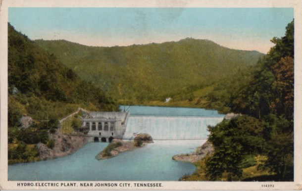
On the back: PLANT OF WATAUGA POWER ON WATAUGA RIVER NEAR JOHNSON CITY WHICH FURNISHES ELECTRICAL CURRENT FOR INDUSTRIAL, COMMERCIAL AND DOMESTIC PURPOSES TO THIS CITY, THE CITY OF BRISTOL AND SEVERAL SMALLER TOWNS.
This is Wilbur Dam. The dam, fully completed and on line in 1912, actually began generating electricity on a test basis to Elizabethton on December 25, 1911, apparently making it the earliest major hydro-electric generating facility in Tennessee. According to Jackie and Dawn Trivette Peters in Images of America – Carter County (page 101), it was named for James Wilbur, a sawmill operator “in the community”. Thanks to Joe Penza, Archivist at the Elizabethton – Carter County Public Library, I found out the whole story and it hinges more on the importance of a railroad name than that of a logging operator. Joe forwarded documents to me that noted the Virginia and Southwestern Railroad Company had established a flag station and side track for the logging operation on Big Laurel Branch. The railroad named it “Wilbur Station”. So, the dam, officially known as “Horseshoe Bend Dam”, took on the name “Wilbur Dam”. When TVA bought the dam in 1945, the name stuck.
Dan Crowe, in his book The Horseshoe People (1976/self-published), quotes an Aunt Cass Carden as saying during the dedication of the dam ceremony, “Youngins, they’re a-burnin’ a hairpin in a bottle.” I think she was referring to a light bulb.
Curt Teich Printing Company of Chicago began producing the (above) C.T. American Art Colored cards in 1915, using an offset printing process. Later, in the early 1930s, using new European inks and linen-effect embossing, they brightened the cards up tremendously. This Asheville Post Card Company card, from the 1970s, shows how the process, along with more careful and artistic photo editing of the original black-and-white photograph, produced a much more pleasing picture. The colors and other details were added at the facility and printed using a five-plate process:

That suspension bridge in front of the dam was for a time the only access to the powerhouse.
This is a Frigidaire promotional post card from around 1955. Frigidaire, which began as a brand in 1916, is now owned by Electrolux. The range I bought about six months ago is a Frigidaire. Heats rather than cools, though.
This card, with a real model instead of a cartoon character, is from 1959. The new FROST-PROOF model, with the freezer compartment on the bottom, and in the infamous Avocado tone. The two brand names I can determine in this screened image are Birdseye (began as General Seafood Corporation by Clarence Birdseye in 1923) and Morton (began in Louisville in 1940). Since nothing in advertising is spontaneous, I suspect some deals got made.
Do not try this pose at home.
Y’know, I think she’s actually wearing that logo crown, which is intensified by the “sunburst” behind her head. I wonder how long it took to set that shot up…
You just never know what will turn up at a local antique store…

As you can see, this portrait was shot at Hodges in Bristol, sometime in the early part of the 20th century. There is no other information anywhere on the picture. It’s just a b&w photographic print mounted on a stiff board, not a carte d’visite. Unless this dude’s carrying a puppy in his coat pocket, he’s awfully wide hipped. He’s also holding up an unfurled umbrella. Is that a code?
You can make all sorts of guesses about his expression.
This post card, published by Beechcraft, was mailed from St. Louis in November, 1960. This aircraft, a Beechcraft Super G18 (G18S), was manufactured in 1959 for delivery in 1960. There were a lot of variants of the aircraft, but, in general, they were dual engine. This one has just the one. Part of the picture here was used as an advertising poster for this Beechcraft. On the back: “Top Speed 234 mph. Top Range 1,626 miles”.
The aircraft ended up in Nuku’acofa, Tonga, as part of their air medical service.
I saw this in downtown Williamson WV. Figured you’d like to see it:


Are those flames coming up from this piggy’s trotters?

I wonder about this 1″ pinback. I found it in a local flea. It’s a plastic finish, but it has an odd texture. No maker mark.
Black pin, white microphone apparently issuing lightning bolts from TN VA. Bizarre.
Probably it’s for an uneasy association of Tennessee and Virginia broadcasters.


According to Tennessee Place Names, by Larry L. Miller (Indiana University Press), Kimberlin Heights got its name, eventually (1887), from Jacob Kimberlin, who mined lead in the area in the late 1700s. In 1897, Ashley S. Johnson founded the School for Evangelists in Kimberlin Heights near the French Broad River. He allowed the school to be named after him in 1909 and stayed as its head until his death in 1925. As those of you who have used typewriters can attest, it’s difficult to type a post card on them. This was nicely done. The stamp isn’t any help in dating the card, since 1 cent postage covered a number of years. Kraus Manufacturing of New York, the publisher of this card, was in business from 1912 to 1930.
The school still exists as Johnson University.


This is essentially a B-29 Superfortress 3.0 – the Boeing 377 Stratocruiser (the C-97 Stratofreighter was 2.0), here flying out of San Francisco. Pan Am was the first to take this plane on a commercial flight (San Francisco to Honolulu) in 1949. Boeing built 55 for commercial use. All of them were retired by 1963.
The back is interesting. I have a couple of cards from the Chicago area, dated in the early 50s, sent to “Lucky Mail Bag” or “Good Luck” to this address (a residence). The last name of the addressee is “Leja” . I have no idea what the “WCPCC” means.
My dad and mom lived in Chicago in the ’30s. They were young and, from what I heard them tell when I was a kid, they had a fine old time.


The Good Year Blimp “Valiant” NC-11A. Built in 1929, it was wrecked when it ran into a mountainside near Piedmont AL on November 22 (or 20), 1930. No one was injured. The car and fins were used to build the “Columbia”, which lifted off in Akron OH in 1931. It encountered devastating winds while attempting to land at Queens Airport in New York on February 12, 1932. The mechanic on board died when the aircraft shifted and dropped him 50 feet into a gravel pit. The pilot survived.
The reason I mention all this is the noting of the 1930 census in the Chamber puff piece on the back. Because of the Great Depression, there was a great political need to find out the extent of unemployment, so the results were hurried out. I doubt if the Chamber of Commerce of St. Pete would have had the information quoted before the second quarter of 1931. This picture was taken in the summer of 1930 (can’t tell from the vegetation, since the picture was hand colored at the printing plant, and, by gum, it’s always summer in St. Pete, I’ve heard) and, by the time this card was published, the blimp was long gone.


I’ve been mulling over this card for several weeks. It bothers me. I grant that it is a picture taken by the legendary Kelly & Green in Bristol. There’s an embossed “K&G 1931” either on the original negative or on the original print. The EKKP around the “PLACE STAMP HERE” square makes this a Real Photo card printed sometime between 1904 and 1950, when this paper stock was discontinued. The rest of the back style seems consistent with a 1930s production date (Real Photos are essentially one-offs).
As is typical with camera lenses of the 30s, the focus gets soft around the edges, but it quite crisp in the middle. ( That’s a fake State Line, by the way. It was drawn in on the negative) However, on the card itself, the focus is tight to where State Street goes over the hill past the railroad tracks.
The blurring on the car in the foreground doesn’t bother me too much. It may have been veering to avoid that dude standing in the middle of the street with a camera on a tripod.
It’s the clean back that bothers me. Yet, Real Photos are printed on a higher quality paper than a regular postcard and, if it was done by K&G, it was properly washed after fixing. If it has been kept separate from any other degrading element (like acidic paper of a photo album), it could very well be in this good condition.
So, I’m 90% sure it’s real. Still, there’s that other 10%.


I can’t find a standard for this on any of the popular sites. The back has a “C 10 Sterling” marking. I would guess that it’s a flight attendant’s pin, but, then, when I was a kid, I mistook a skunk for a cat. Shows you how much I know.


I don’t know why I always get the odd ones. The standard for this late 1950’s Junior Stewardess pin, given out to young girls when they boarded a Delta plane, is at Fly the Branded Skies. Look under “D” for Delta. Mine, however, lacks the cardboard backing that came with every kiddie wings, the Delta logo is crooked and the back’s really crudely done. No hallmark, either. Bummer.