
Author Archives: Bob Lawrence
Yeller Cab


I’m going to put this in a new card folder, but this is mostly how it looked when I bought it (for under $4). My pencil notation is what I dug up on the web.
In the Land of the Sky
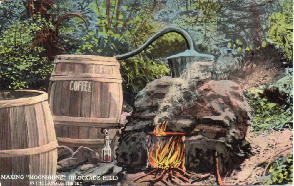
I was going through a pile of perfectly uninteresting post cards at a flea market and happened across this one. I recognized that it was early, so, for research practice, I bought for the extravagant sum of $1.
Turned out to be an interesting card. It dates to around 1913 and refers to a sobriquet once applied to the State of North Carolina. The Land of the Sky, or, Adventures in Mountain Byways is a book published in 1876 by Christian Reid, a.k.a. Mrs. Frances Tiernan. Later, Asheville adopted the phrase to describe its own vaunted location. I don’t get the “coffee” bit, nor the reference to Blockade Hill, but I haven’t read the book and will read it probably never, so, well, there you are.
The card was published by Southern Post Card Company in Asheville and it was printed by Curt Teich in Chicago. Teich’s inventory numbers weren’t as organized the the teens as they later became, but the number does set it right at 1913. In 1914, the publishing houses went to the “Let’s Save Ink!” white-border style (oh, a note: as I’ve mentioned before, if you read that the “linen era” cards were called that because using linen gave them a nice texture, you’ll know the author didn’t know about post card production…the linen finish was applied during printing by using a special textured plate). Read all about it in the excellent Postcard America, Curt Teich and the Imaging of a Nation by Jeffrey L. Meikle (University of Texas Press, 2015/ISBN 978-0-292-72661-1)
Good card. Glad I forked over a buck for it.
The Old Land of Oz

I dunno. I think the costumes are creepy. The Tin Man looks like something from “Radar Men from the Moon” (1952)(look it up. it stars Commando Cody, the man with an asbestos ass). Dorothy is lovely, though, fake pigtails and all. The place opened in ’70, burned in ’75 and closed in ’80. The fire destroyed the original Dorothy dress from the movie, along with other artifacts. It fell into disrepair and was vandalized. It’s now open again for short periods during the year.
John Mellencamp sang, “Life goes on, long after the thrill of living is gone…”
Postcard published by Land of Oz…no printer’s credit shown.
(I know that Dorothy looks as if she’s floating. Trick of the light – she has her right foot raised slightly to look as if she’s walking.)
Grts, Pennington Gap
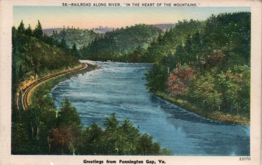
“Grts”, in post card lingo, often refers to a card with “Greetings from…” on the front. The picture on the front of this card is some generic view of a river with a train steaming along it. When I looked, the railroad in Pennington doesn’t get too close to the Powell River, anyway. The overprint just ties it to Pennington, for tourism’s sake, you know. I would date this card to the late 40s, early 50s.
Free Offer


From 1944, as the expiry date shows. See Seven States! If your eyes are good, you can see the back of your head, clear around the world!

Glade Spring VA
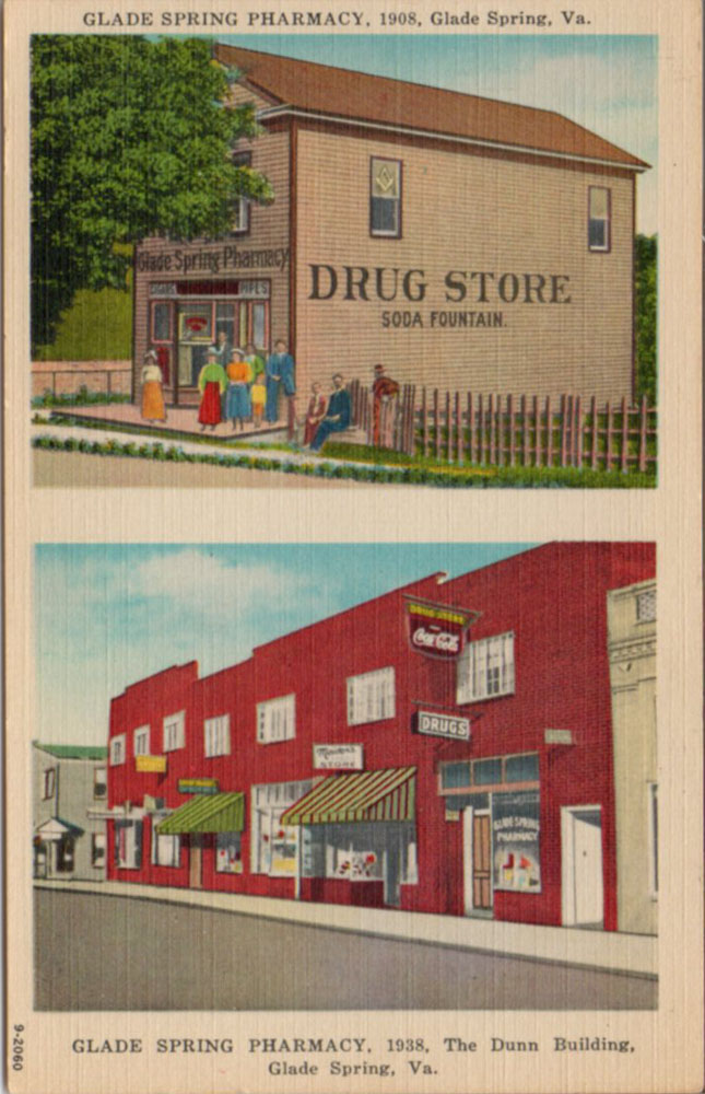

To me, this is an interesting post card. It was published by Asheville Post Card Company in the late 40s and it doesn’t feature original photographs taken by the company. These are historic black & white photos that were colored in before printing. No photographer is credited. I suppose that the pharmacy provided the photos to APCC to use.
Town Creek

Downtown Abingdon VA. The house behind the trees was for sale the day I was there. Great location. Price would probably make my eyes water. Abingdon’s trendy these days.
Flea Market Find!
Sort of..

I call it an “8-bit Dragon”. Bamboo beads. 6.5 x 7″.
It’s a hot pad. It’s called a trivet. In my vocabulary, a trivet is generally metal and has three legs.
A rose by any other name is a trivet.
I have two of them. Sigh.
First Methodist Church, Johnson City TN
Other than the original photos being taken from different viewpoints (or using different lenses), there are four differences between these two cards:
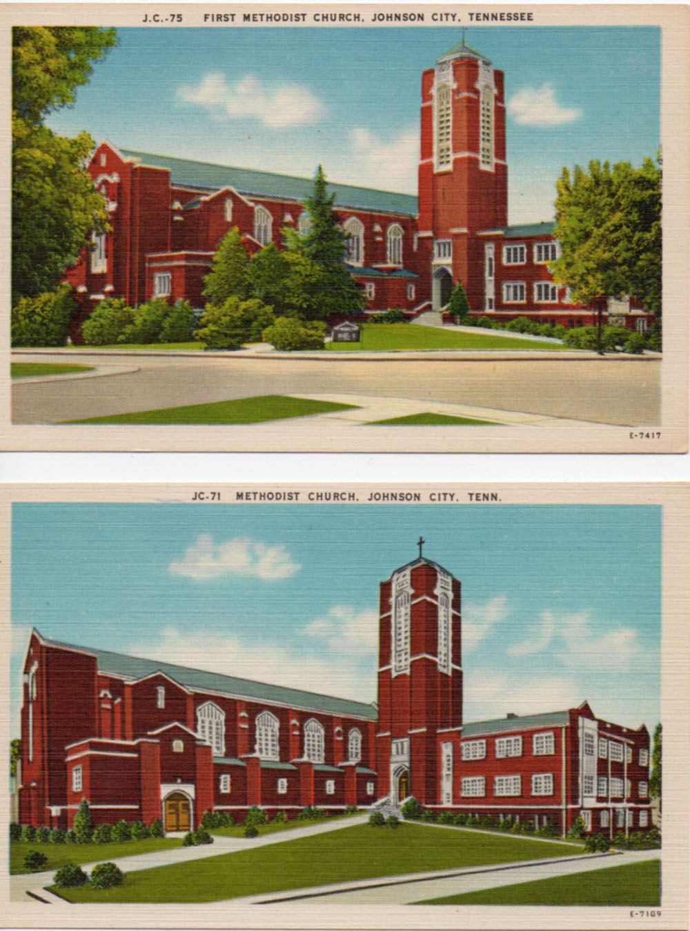
The lower one, obviously, is the earlier. I think it may have been taken pre-WWII. The upper one, probably late 40s.
The differences I see: First, the plate numbers are different (I can only date Asheville Post Card Company cards by inference. I found another card in the E-7417 range that had a 1948 post mark). Second, the shrubbery. Third, the sign on the corner in front of the church. Fourth, the early one is titled merely “JC-71 Methodist Church, Johnson City, Tenn.” and the later one is “JC-75 First Methodist Church, Johnson City, Tenn.”
Professional Building Woodlawn Avenue Bristol, Tennessee


This damaged card is from the 1950s. Woodlawn Avenue does not appear on any current maps of Bristol TN. It may be under a different name now.
On the back: Professional Building, Woodlawn Avenue, Bristol, Tennessee The Tri-Cities’ newest and finest office building. Five stories completely air conditioned with paved parking lot accommodating 170 cars. Beautiful interiors, elevator service, drug and fountain service. Gorham Boynton, manager. Telephone SOuth 4-4189
Thank you to Rob (see comment below), who wrote: The building is now Graceway Pharmaceuticals and the address is 340 MLK Blvd. Bristol, TN (08/31/21)
Greetings From Mountain City, Tenn.
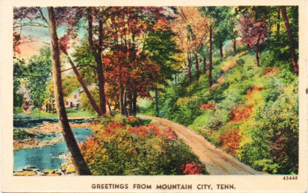
The style of the back of the card dates this to the 1930s. Asheville Post Card Company was using this sort of anonymous back for some reason known only to the company. Later, they were proud to identify themselves on all cards. This is a linen-finish card.
Also, my research turned up the fact that the scene on the front is generic. Not in Mountain City nor in its environs. Although, an editor for APCC said, in an old interview, that people would sometimes “recognize” the scene as being in their particular area.
I did lighten the front of the card. It’s got some age on it.
Btw, the lowest temperature on record in Tennessee was reported in Mountain City on December 30, 1917: -32 degrees.
Let’s Go to Galax!
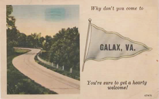

Asheville Post Card Company issue called a “Pennant Landscape”
The “Galax, VA.” is an overprint for a standard card.
It was mailed in 1943, when Galax had half its current population. It’s hard to read the writing, but I did find Sgt. Marrion W(oodward) Fisher. Camp Santa Anita was a dog racing park in Arcadia CA that had been taken over by the Army for ordnance training. Sgt. Fisher was born in 1920 in Bath VA. He died in 2011 in Covington VA.
I think the signature on the card is “James”
Buford Williams and Gerald T. Lowe

Buford’s on the left, Gerald “Jerry” is on the right. Both were veterans of WWII.
Buford retired from TVA and died at 92 in Knoxville.
Gerald, who was from Maryville, died in 2003, but I don’t know anything more about it…can’t find an obit.
S.S. Nassau
If you were venturing into the southern climes back around 1956 or so, you might have been on this ocean liner:

The S.S. Nassau. It began life in 1922 as the S.S. Mongolia, built in England. After a number of name changes, it became the Nassau from 1951 to 1961. It ended up on the West Coast as the S.S. Acapulco, flying the Mexican flag, the only ocean liner to have done so. But, after 40 years of service, it pretty much ground to a halt on the return trip from England, where she had gone for repairs to her prow. After a couple of years as a hotel ship, she was scrapped in 1964.
Here’s the back:
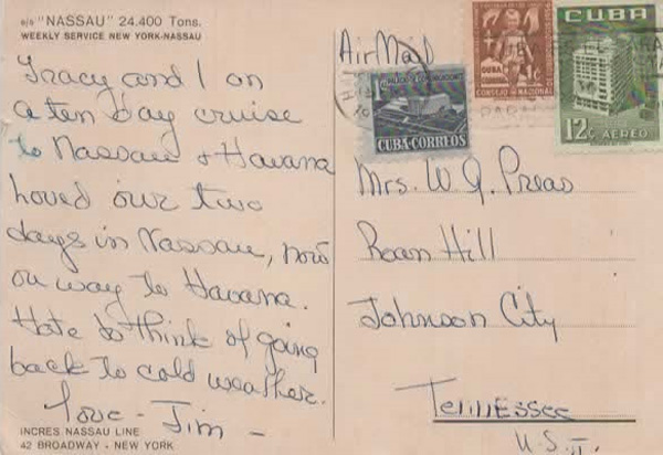
Note the Cuban Cure for Tuberculosis stamp, dated 1956. The actual date of the postmark isn’t visible, but it couldn’t have been before 1956. Tracy and Jim are having a fab time, apparently, and not looking forward to returning.
This post card is larger than the more-or-less standard (5-1/2 x 3-1/2″). It measures 5-5/8 x 4″. Continental post card size is 6 x 4…just 2/8″ shy.


